Controls
Buttons
Activate a labeled command after a complete press and release gesture.
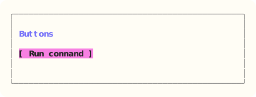
The site build compiles the dedicated Ada component example, constructs Buttons through its public API, and exports that exact styled surface. Read the capture source.
When to use it
Use a button for an immediate, named action. Keep persistent choices in check boxes, radios, or selectors.
State and ownership
The Flyology_TUI.Components.Buttons package defines this component.
The label and appearance stay outside the interaction model. The model retains focus, hover, armed state, and capture.
- The application model owner applies updates during serial event dispatch.
- Appearance and skin values are borrowed only while the component renders.
Input and updates
Enter and Space activate immediately. A mouse press arms the button; only a matching release inside activates it.
Integration sequence
- Create the bounded model and populate it with caller-owned data.
- Route the current keyboard or local mouse event through the component handler.
- Apply the typed result, then render from the updated model with the current appearance.
See the linked package reference for its exact declarations and contracts.
Responsive and accessible behavior
- Use dimensions and regions from the current layout or presentation value.
- When a component owns mouse capture, route its matching release even when the pointer leaves the original bounds.
- Retain a glyph, label, border, or text-attribute cue when the terminal reduces color.